Is do the colours on the walls affect your mood?

Thicket inspirations

Living surrounded by social media and television has certainly broadened our knowledge of the various ways of interior design. There are so many possibilities for combinations that, de facto, we are only limited by our imagination.

Sometimes, however, in our preoccupation with the colours of a furniture shop catalogue, we overlook the psychology of colours, and yet we will be spending dozens of hours a day in these rooms. A vague recollection from art lessons may come in handy here, but should certainly be enriched with additional information.

Im the longer the wave, the more energy

Before we move on to the significance of each colour, it is worth pausing for theory. In fact, sunlight is the source of our colour fever. Surely each of us has seen at least a few rainbows in our lives. In order to produce a seven-coloured arc, sunlight has to split in raindrops. The resulting colours are a physical phenomenon. Each colour is assigned a different wavelength.

So, in order to see a particular colour our brain has to process its length. The longer it is, the more taxing it is for our body. It has been observed that when gazing at colours with long wavelengths, our metabolism works more efficiently and so we are more stimulated. Such colours include the warmest colours - red, orange and yellow. Hence, they tend to be avoided in children's spaces. Similarly, at the other end of the spectrum are colours with short wavelengths - blue, green, violet. They have a calming effect, after all, most of them naturally occurring in nature.

Anyone serves a different purpose

Although colours can be looked at from different angles, whether cultural or biological, it is worth remembering that psychologists also have their own theory about them.

Red

The colour with the longest length and therefore the most energetic. It is now experiencing a renaissance, although excessive use of this colour can still be tiring. It will certainly work well in corridors, dining rooms or gyms. In the right quantity, it will provide a boost of activity and will certainly work well for overtired people.


Orange

This combination of red and yellow has been on our walls for years. Unsurprisingly, its expansive palette allows for subtle as well as dramatic effects. Hence, with a skilful choice of shade, it can adorn the walls of our bedroom or be found in the children's playroom.


Yellow

For many, one of the most positive colours, it also has a huge range of shades. Although it still has quite a stimulating effect on our mind, it can be used confidently in a child's room to warm them up for learning. It will work equally well in the living room or kitchen. It is one of those colours that is easiest to combine in interesting compositions.

Satisfaction
begins with a meeting

Green

It is one of the most relaxing colours, evoking a green glade or forest. This soothing influence is sure to find its adherents because of the hectic lifestyle and the tension that comes with it. It is such a versatile colour that it can easily be used in all areas of the home. Depending on the lighting in the room, we should gradate its intensity.
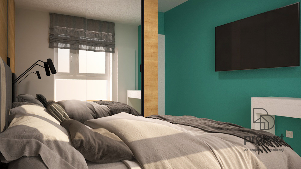
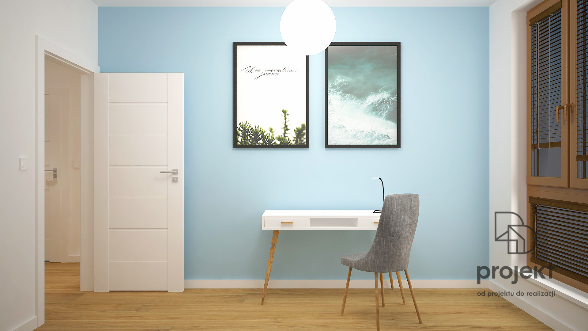
 

Blue

It calms and induces a sense of security. It also has the property of lowering blood pressure and reducing appetite. It is an extremely elegant colour, which is why its shades are often found in offices and specialist practices. Due to its calming nature, it is perfect for the bedroom, living room or children's room.


Violet

Throughout the ages, it has symbolised royal power. It is possible that the people of the time knew the great potential of this colour. It has a calming effect and relieves stress, hence its effect is similar to blue. Like blue, purple is a very chic colour, so it will look very tasteful in the living room. Using the right shade, it will work well in any room.


Bronze

It gives a strong sense of security, but should be avoided in rooms with little sunlight. Used skilfully, it will add a touch of sophistication to a room.
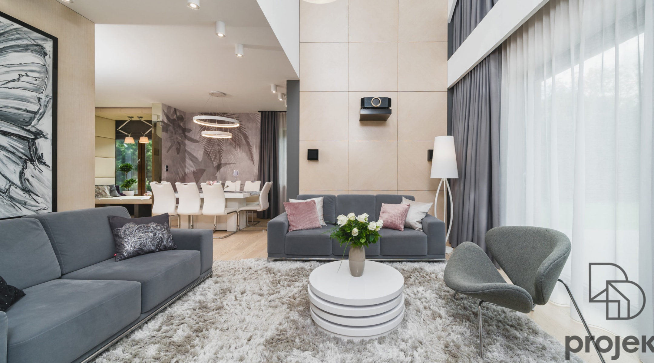
 

Black and white

These are not colours from a professional point of view, but they can certainly play an equally important role in the decoration of a home. White relieves stress and gives a sense of freedom, so it will work well where creative thinking is required. Black, on the other hand, has a highly motivating effect, and is equally at home in offices or other rooms requiring concentration.

Request a quote